I’ve been using Canva since it’s invitation-only beta launch in 2013, and love the simplicity of its ready-to-use templates, which makes for drag-and-drop design software that is easy to use (and free!). What I didn’t know though was that Canva also has a photo editor as part of its suite…
Way back in 2011, I was just starting to tinker with my photos. I didn’t have dedicated photo editing software and was using whatever was easy and free online. Since then I’ve progressed from Photoshop Elements to Lightroom, and don’t have the need to use online photo editing apps any longer, but am always mindful that there are others out there, who like 2011 me, are just starting out with their photography journey.
Then one of the folks from Canva reached out and asked me to do a review of Canva’s Photo Editor, which brouth their photo editor, colour palette generator and font combinations tools to my attention as well.
So, I had a play around with Photo Editor and here’s what I thought:
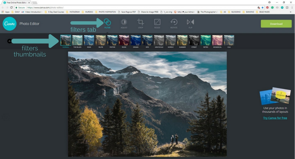
There’s an array of filters to suit any style. My personal favourites are Street (because I love dark and moody black and white images) and Cali for its matte effect. I like too that you get a thumbnail preview of each filter so you get a bit of an idea as to what your photo will look like before you click.
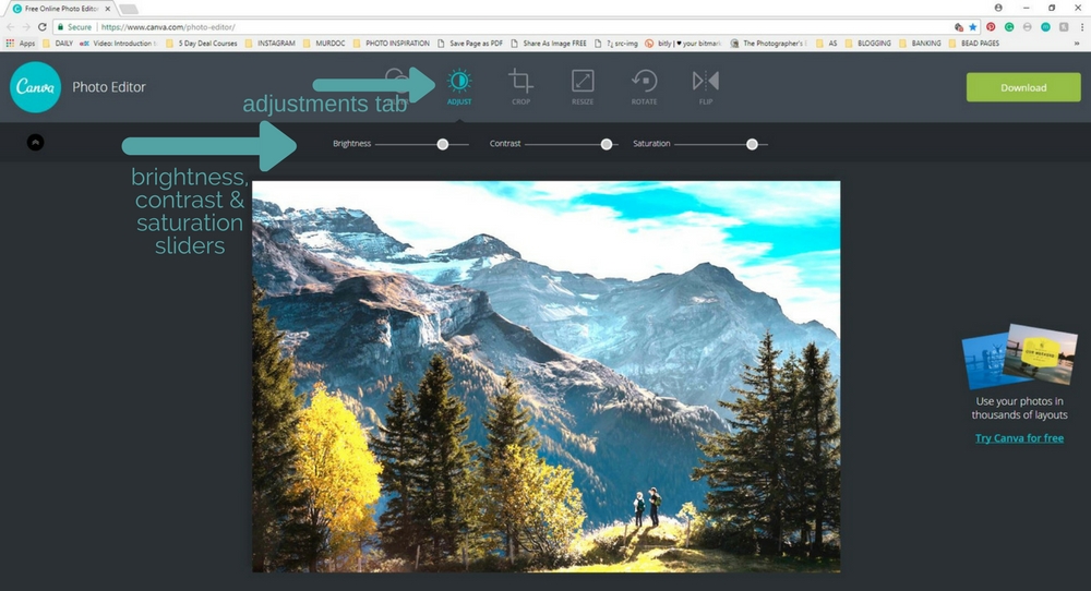
The next tab along allows you to adjust your brightness, contrast, and saturation. There’s plenty of scope to play here and tweak the image. As I’m now used to Lightroom, the sliders aren’t fine-tuned enough for my liking, but if you are just starting out with photography it’s a great way to learn about what brightness, contrast, and saturation can do to your photo.
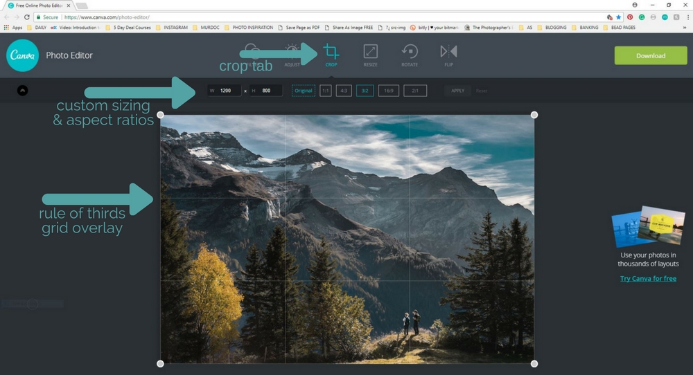
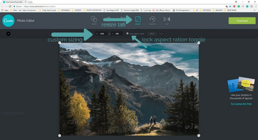
Then comes the crop tab. You have the option to set a custom size for your image, using the width (W) and height (H) boxes, which is handy if you know you want to resize an image to a specific size and purpose, e.g. a blog header. The 1:1 ratio is your square option and just right for resizing for Instagram. From there though, the aspect ratios (the relationship between the width and the height of an image) aren’t sizes that are commonly used in photography. It doesn’t hurt to play with them though! And they have the ever handy rule-of-thirds overlay on the photo, so you can crop to divide your frame into thirds with the main focus of your image on one of the horizontal or vertical lines or at one of the points where they intersect.
 The resize tab is next. If you leave the ‘lock aspect ration’ toggle box ticked, when you drag the little white circles in the corner of your image, it will keep your aspect ratio and not distort the image. It’s when you untick it that things can get a little funky. It’s actually one of my pet peeves… photos that have had their aspect ratios messed with… they just don’t look right!
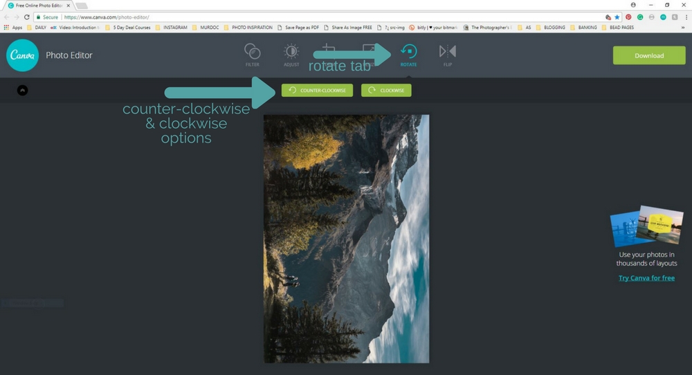
The rotate function is pretty simple – clockwise or counter-clockwise. Not something I have a use for every day, but handy to have just in case…
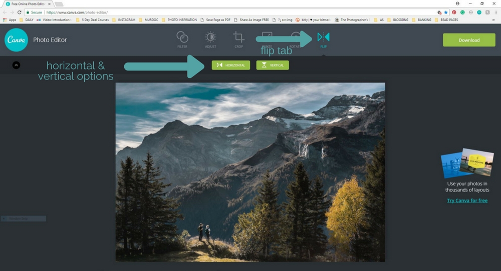
And then finally is this flip tab. Believe it or not, sometimes an image looks 100% better if you flip it!
And there you have it – Canva Photo Editor.
It’s a simple site and while it may not be of use to the more advanced photographer (unless you’re on the road and your editing software is really playing up!), it is perfect for the photographer who is starting out and learning about post-processing. It’s easy to use and best of all is free.
So, would I recommend Canva Photo Editor?
Yes, I certainly would.
This is not a paid promotion of Canva Photo Editor. The team reached out and asked me to review it. I agreed because I’m all for sharing useful tools with fellow photographers.


Awesome post Tasha! Thank you so much for doing this. It’s our vision to make design accessible to everyone, and your post goes a long way in educating people as to what we’re about. Pleasure working with you.