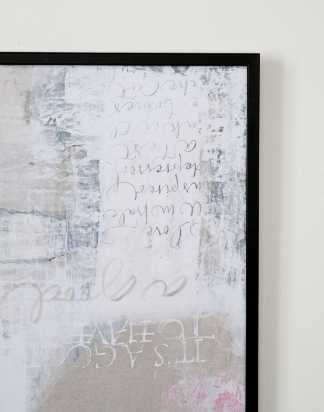
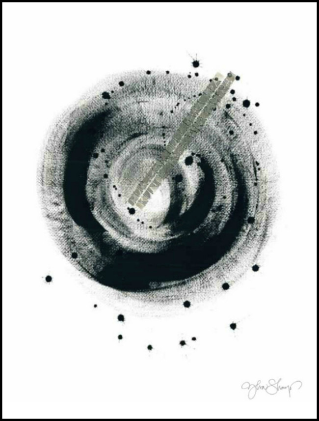
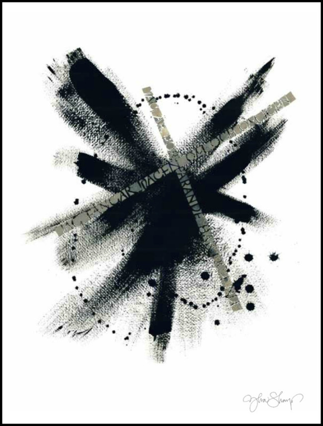
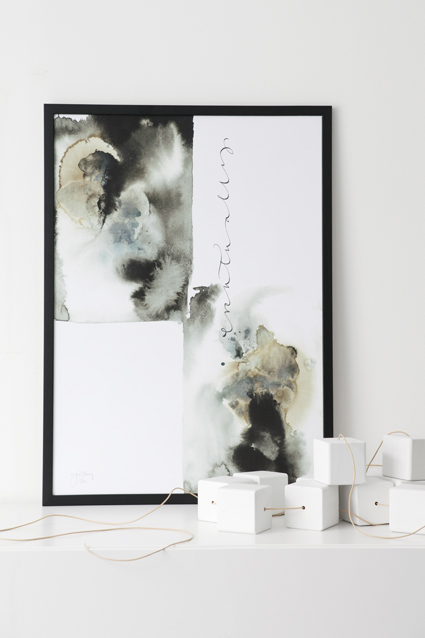
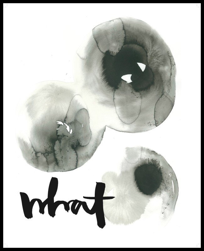
I recently came across the work of Ylva Skarp in the March edition of Real Living magazine.
I don’t know if it’s because I have a thing for black & white work, or if it is the watercolour effects that she uses so well – but I’ve fallen majorly for her print works.
Maybe it’s her philosophy on things being a little bit different that strikes a chord…
“Some elements may be a bit unexpected, but I can’t stand perfection – things need to be a little irregular.”
Mixing modern and traditional, Ylva turns calligraphy into patterns, which she has also incorporated in to a range of homewares including cushions and ceramics.
You can see more of Ylva’s designs at her website – be sure and check out the catalogue of her work!

